
DAMNATION - VISUAL IDENTITY
Damnation sheds light on issues of inequality, class war fare and the zero-sum game of “progress”, problems our country has struggled with since its inception. In order to successfully sell this show, we knew the visual language had to be powerful, visceral and violent, yet the imagery would have to be intriguing enough to get viewers to want to know more about the subject.
Strategically, we wanted to make sure we touched on the parallels between 1930’s and today’s America, the conflict and struggle between big businesses and the downtrodden, and the relationship between two brothers fighting on either side of this struggle. We drew our inspiration from the color palettes, production design and cinematography of this beautifully photographed show.


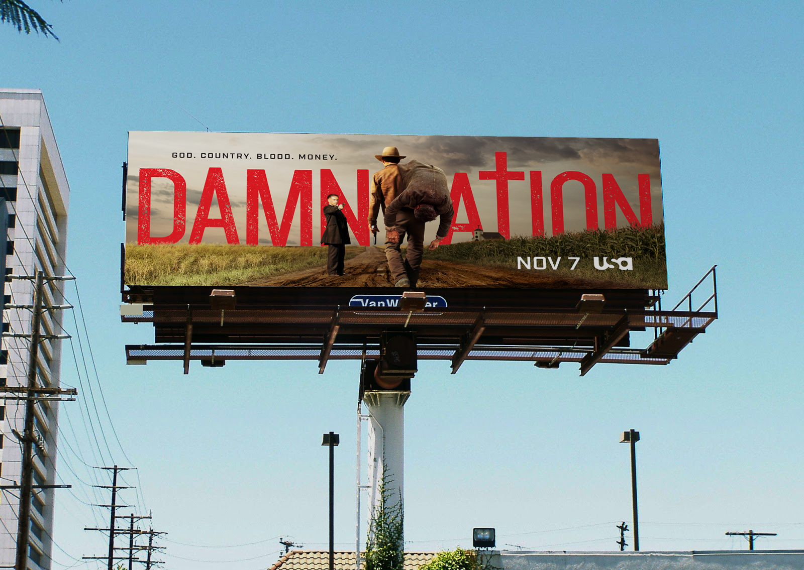
The challenge for us, was making sure we'd mirror that authenticity. Shooting on location and making use of the epic landscapes and natural colors of the surroundings to capture as much as we could in-camera, was the only way we could come up with to accomplish that.

FROM CONCEPT TO SHOOT TO FINAL EXECUTION
We hired a photographer who could capture both still and motion photography and worked closely with show’s production team to capture some epic imagery. Despite a few logistical hiccups, we managed to get everything (and more) that we set out to capture. The result was a library of assets that could be used to create content for variety of uses across multiple platforms.

As creative director on this project it was my job to concept, pitch and lead this production.